IPM CPM Level 1


hamburger__close
A burndown chart is one of the simplest and most widely used tools in Agile project management, giving teams and stakeholders an at-a-glance view of how much work remains against how much time is left. Despite its simplicity, it remains one of the most effective ways to spot whether a sprint or project is on track, ahead of schedule, or heading for trouble. This guide explains what a burndown chart is, how to read and build one, and how it fits alongside other Agile tracking tools.
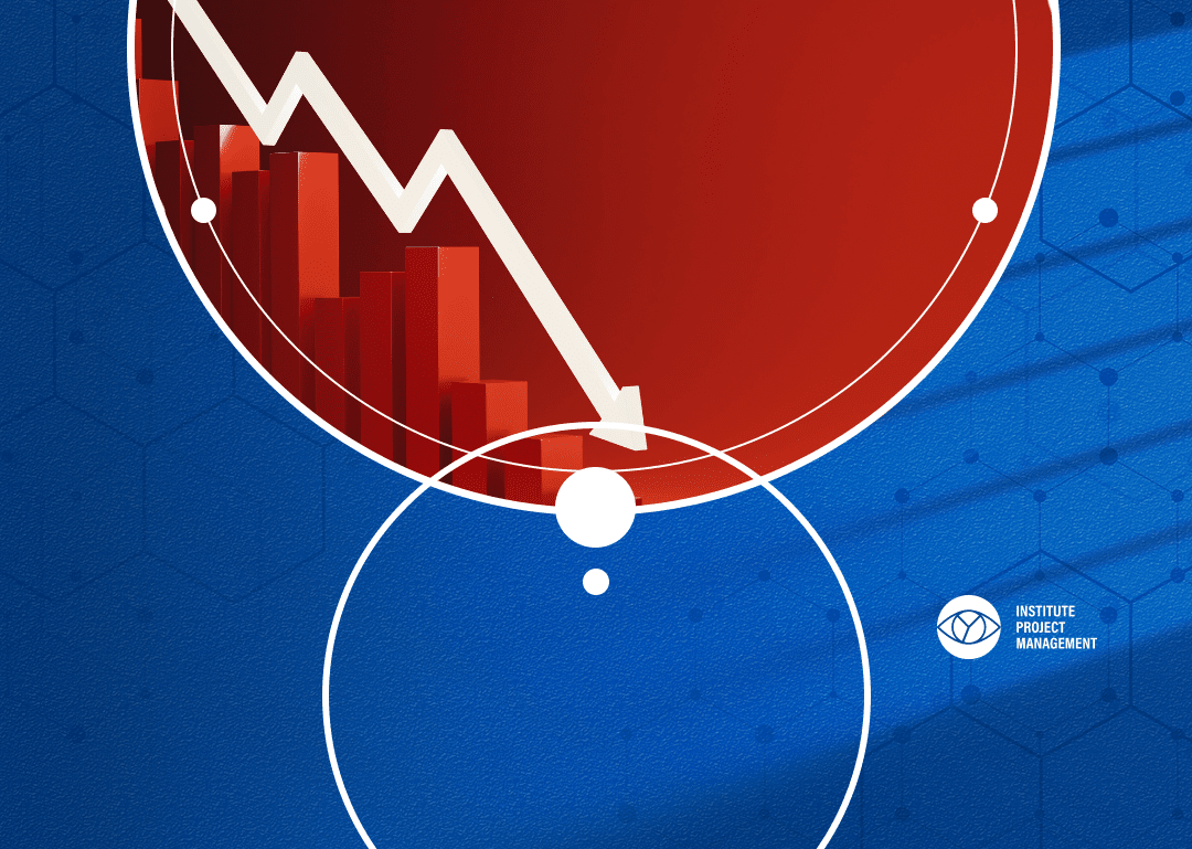
A burndown chart is a visual representation of work remaining over time, typically plotted with time on the horizontal axis and remaining effort, measured in story points, hours, or tasks, on the vertical axis. As work is completed, the line on the chart moves downward toward zero, giving the chart its name. Scrum teams most commonly use burndown charts at the sprint level, tracking whether the team is completing planned work at a pace that will bring the remaining work to zero by the end of the sprint.
Every burndown chart includes two key lines: the ideal trend line, a straight diagonal line showing the theoretically perfect, steady rate of progress needed to finish on time, and the actual trend line, which plots real progress as the team reports completed work. When the actual line sits above the ideal line, the team is behind schedule. When it sits below, the team is ahead. A flat section in the actual line signals a period with no reported progress, which is often the first visual cue that a blocker or scope issue needs investigating.
Building a burndown chart starts with estimating the total scope of work for the sprint or project, usually in story points or hours, and plotting that total as the starting point on day one. From there, the ideal trend line is drawn as a straight line from that starting total down to zero on the final day. As each working day passes, the team records actual remaining work, which is plotted as the actual trend line. Most Agile tools, including Jira, Azure DevOps, and Trello with add-ons, generate this chart automatically once a team logs estimates and daily progress, though many teams still build one manually in a spreadsheet when starting out.
A burndown chart and a burn-up chart track the same underlying data from two different angles. A burndown chart shows work remaining trending toward zero, which makes it easy to see whether a sprint will finish on time. A burn up chart instead shows work completed trending upward toward a total scope line, which makes it easier to spot when scope itself has changed mid-sprint, something a burndown chart can obscure. Many mature Agile teams use both charts side by side rather than choosing one over the other.
The most frequent mistake is failing to update the actual trend line daily, which turns the chart from a live tracking tool into a retrospective curiosity. A second common issue is re-estimating story points mid-sprint, which distorts the ideal line and makes trend comparisons meaningless. Finally, treating the burndown chart as a performance-management tool for individuals, rather than a team-level planning aid, tends to encourage inflated status updates rather than honest reporting, undermining the very purpose of the chart.
Scrum remains the dominant Agile framework in UK teams, with 63% of team-level Agile practitioners following it as their primary approach1, and the burndown chart is one of Scrum’s most enduring artefacts precisely because it gives Product Owners, Scrum Masters, and stakeholders a shared, low-effort way to track delivery risk without needing a status meeting. For UK organisations increasingly running hybrid delivery models that blend Agile and traditional governance, a burndown chart also translates naturally into the kind of progress reporting that steering committees and PMOs expect.
Beyond the two headline trend lines, a handful of supporting metrics turn a burndown chart from a static picture into a genuinely predictive tool. Velocity, the average amount of work a team completes per sprint, lets a Scrum Master forecast whether the current burndown trajectory is realistic given historical performance, rather than judging it against an arbitrary straight line alone. The slope of the actual trend line over the first two or three days of a sprint is also a strong early indicator: a flat start followed by a sudden late-sprint rush, sometimes called a hockey-stick pattern, often signals that work was not broken down into small enough increments during sprint planning. Tracking these patterns sprint over sprint helps teams refine their estimation and planning process well beyond what a single chart can show in isolation.
While burndown charts originated as a Scrum artefact tied to fixed-length sprints, many Kanban and hybrid teams adapt the same concept to track a release, epic, or fixed body of backlog work rather than a time-boxed sprint. In this context, the chart tracks remaining items or story points against a target completion date rather than a sprint boundary, giving continuous-flow teams a similar early-warning signal without adopting the rest of the Scrum framework. This flexibility is one reason the burndown chart has remained relevant even as many UK organisations move toward blended, tailored Agile approaches rather than textbook Scrum.
| Aspect | What to Know | Why It Matters |
| Purpose | Tracks remaining work against time | Gives an early warning of schedule risk |
| Two lines | Ideal trend vs actual trend | Shows whether the team is ahead, on track, or behind |
| Best used at | Sprint level in Scrum teams | Matches the two-to-four-week cadence of most sprints |
| Limitation | Can hide scope changes | Pair with a burn up chart when scope shifts mid-sprint |
| Tools | Jira, Azure DevOps, spreadsheets | Most generate the chart automatically from logged estimates |
A burndown chart works best as part of a small family of complementary metrics rather than in isolation. A velocity chart, which tracks story points completed per sprint over several sprints, helps a team understand whether their capacity is genuinely stable or trending up or down, context a single sprint’s burndown chart cannot provide on its own. A cumulative flow diagram, more commonly used by Kanban teams, shows the volume of work in each workflow stage over time and is particularly good at revealing bottlenecks that a burndown chart, which only tracks total remaining work, would not surface. Cycle time and lead time metrics add a further layer, showing how long individual items take to move through the system rather than how much total work remains. Together, these metrics give a Scrum Master or delivery lead a far more complete diagnostic picture than any single chart alone, with the burndown chart serving as the simplest, most stakeholder-friendly entry point into that broader metric set.
While burndown charts are most associated with software development, the same principle applies wherever a defined body of work needs tracking against a deadline. Marketing teams use burndown charts to track campaign task completion ahead of a launch date. Construction and infrastructure programmes sometimes adapt a simplified version to track milestone completion against a project schedule, even when the broader methodology is predictive rather than Agile. HR and operations teams running structured change initiatives, such as a system migration or office relocation, have also adopted burndown-style tracking to give leadership a simple, visual sense of how much remains before a hard deadline. The chart’s core value, translating abstract progress into an intuitive, falling line, transfers well beyond its Scrum origins.
A burndown chart earns its place as one of Agile’s most enduring tools because it turns a team’s daily progress into a single, honest visual that anyone can interpret in seconds. Used consistently and updated daily, it gives Scrum Masters and stakeholders an early, low-friction warning system for schedule risk, long before a sprint review reveals the same problem the hard way.
Earn a Scrum Master certification through our Professional Scrum Master Training, preparing you to excel in a Scrum environment.

A burndown chart shows how much work remains in a sprint or project over time, comparing an ideal trend line against the team’s actual reported progress.
It is most closely associated with Scrum, but any team using time-boxed delivery cycles, including Kanban teams tracking cycle-level work, can use a simplified version of the chart.
A healthy burndown chart shows the actual trend line following the ideal trend line reasonably closely, with small daily dips as work is completed, rather than long flat periods followed by a last-minute rush.
Yes. If new work or re-estimated story points are added mid-sprint, the remaining-work total can increase, causing the actual trend line to rise temporarily before continuing downward.
In most Scrum teams, the Scrum Master or a designated team member updates the chart daily based on the team’s own reporting during or immediately after the daily stand-up, keeping the responsibility close to the people doing the work rather than a separate reporting function.
The chart itself works identically, but remote teams benefit from making it visible in a shared digital space, such as a pinned dashboard in the team’s chat tool, since the passive visibility a physical wall chart once provided in a co-located office needs a deliberate digital equivalent.